ShopDreamUp AI ArtDreamUp
Deviation Actions

A
is for
Aperture
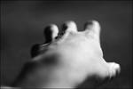
The aperture is the opening that allows light to enter your camera - it's usually a circular part of the lens. The size of the aperture is described in f-stops, written as numbers like f/1.8 and f/8, where a larger number on the bottom means the light entering your camera is being divided by a larger denominator.
Most lenses allow you to open or close your aperture to change the exposure: by opening your aperture (moving from a smaller aperture to a larger one - from a larger f-number like f/22 to a smaller one like f/11) you let more light into the camera and the image is more exposed. Older lenses and manual cameras will usually have a ring on the lens to change the aperture, but newer cameras generally have an aperture setting in the camera itself that changes it automatically when the shutter release is pressed.
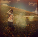
Opening your aperture also makes your depth of field - the range of focus that is sharp - narrower, and closing your aperture makes it wider.

B
is for
Back Lighting
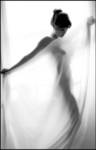
Back lighting is a technique used in a wide variety of photography for two very different reasons. Many of you have probably had a passport photo taken, and when the camera's flash went off it triggered another, off-camera flash that lit up the background behind you - this type of back lighting is a type of fill flash, used to eliminate shadows behind the subject.
It's also used, though, for artistic effect in silhouette photographs. By making the background of the image much brighter than the foreground, you can meter the photo's background as being of average brightness and thereby make the subject look darker or even completely shadowed. By exposing it so that the image is metered normally on the subject instead of the background, you can create a look of light wrapping around the subject.

C
is for
Colour Balance
Colour balance is a term used in colour photography meaning that, under a given light source, the medium you're using to take the picture would reproduce a full range of grey tones accurately. It basically means the same thing as white balance.
Most digital cameras can adjust for this using automatic or manual white balance settings, but different colour films have widely different balances and are better for specific uses if accurate representation of colour is desired - Fujichrome Velvia films are balanced to truthfully capture images shot in sunlight and are often used in nature photography, whereas Fujicolor Pro NPL 160 was balanced for exposure under tungsten lighting and was a good everyday indoor photography film.
Use of "improper" colour balance can be used for artistic effect, to give your images a cooler or warmer palette.
:thumb127820558::thumb159992496:

D
is for
Double Exposure
Double exposure is one of the more common "alternative" photography techniques - it is the capture of two different images on one frame, so that they blend together as sort of an overlay.
It's relatively common in film photography, being done intentionally but also happening sometimes by accident if your camera doesn't automatically wind after you take a picture and you forget to advance the frame, but is a bit more rare with digital photography, where it is an example of digital darkroom technique (post-production of digital work to make it approximate what is possible with film photography).

Beasts
Keeping this shortish: A while back my prime wife @madnessism started a fun little collective over to the side called The Beasts of AI and I've been a part of it for a couple months. We're mostly twitter active, but because of the drama around twitter currently some of us are migrating some work over to DA to get new eyes on it. I didn't want the baggage of this account tied to it (and will not be active in any sense of the term apart from posting my work) so if you want to check out my stuff drop me a watch on @exquisitest. You can also check out some of our early-adopter comrades at @artistficially, @king0lightai and @L3VEL7 - and eventually we'll be setting up @thebeastsofai as a group to collect all our stuff in one space. Check us out @ thebeastsofai on twitter too - we run some neat initiatives. I haven't talked much about my life as an artist after my health issues in 2017, but I've had limited ability to create since then. This is why I'm embracing AI and I view it largely as
A Check-In
I'm Not "Back"
So don't get excited. I just know this is a convenient way to broadcast an update to y'all on where life has led me. I'm still not around much, if at all. I do check my messages maybe once a week and pop on the chat network when I get a snow day at work. I'm creating, but it's not meant for y'all. :pringles:
So illness sucks. That's not up for debate. All types of illness suck. A cold sucks. Scrambled nerves suck. Depression sucks. Vague autoimmune diarrhea sucks. Abscessed molars suck. Herpes sucks. (Not crotchpox. The shingles. I'm less sexually active than a Buddhist nun.) Then it all gets better. Medication juggling is an
One Last Update
Words?
So by now you've probably noticed I'm not around much. It happens.
My life has gravitated elsewhere. "Elsewhere" is this weird and wonderful place of reading tarot semi-professionally, growing okra, playing cards every Wednesday with my 78-year-old great aunt Annette over a bottle of moonshine, owning roughly half of a rapidly growing art-oriented web startup, and trying to find a local beer I don't hate since I've moved cross-country and they don't sell my brand here.
It isn't that I dislike DA. It isn't that my experiences here weren't important, or fun most of the time. The place just has a lot of memories, some good and some terr
Choosing Paints, Part II: HEAVY METAL HEXAGRAMS
Trad Basics Week
Re-Introduction
In the previous installment, Choosing Paints, Part I: Fat and ... Translucent?, we discussed picking your first paint, monochromatic painting and the two-colour and Zorn palettes. For 3300 words. And you thought that was enough learning. :evillaugh:
What we're trying to prevent: Bad life choices, and unsaleable art that leads to the ramen diet.
Today we're going to go over the basic palette of six colours as a launching point for artistic success. These tips apply to all painterly media - oils, acrylics, watercolours, gouache, pastel, you name it and it fits. Let's start with the dry stuff:
The Six Colour
© 2010 - 2024 isthisthingstillon
Comments28
Join the community to add your comment. Already a deviant? Log In
Thanks ^^